| NeuroScript MovAlyzeR Help | Send comments on this topic. |
Glossary Item Box
| NeuroScript MovAlyzeR Help | Send comments on this topic. |
Analysis Charts
This is a common topic for MovALyzeR, GripAlyzeR & ScriptAlyzeR. These programs will be referred to as MovAlyzeR on this page.
Analysis charts is an extremely powerful data analysis tool.
It shows processed trials that have been summarized across trials, conditions, subjects, groups.
Raw data, averages, and standard deviations can be plotted against any other variable.
o Right-click a particular experiment > Analysis > Analysis Charts.
o Select scatter plot ( >All trials), with averages and SDs (>All Data), only averages (>Averages), averages of the averages per subject (>Average/Subject).
o Other charts can be selected.
o Average per subject allows simple statistical comparisons (Actions >View Statistics)
o Select X-axis variable. Non-integer X values are rounded to the nearest integer. Set Action=Offset/Scaling to change the integer granularity.
o Select Y-axis variable.
o Select Grouping variable. Each rounded integer level yields a new curve.
o See various Actions to customize
o After applying adjustments view new chart by pressing Refresh.
o right click in chart for viewing, customization, and export options.
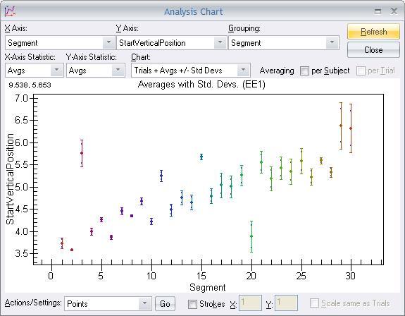
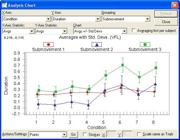
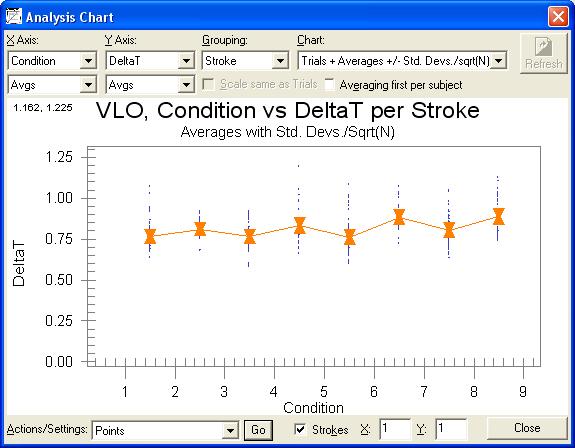
EXAMPLE
~ Select X Axis= Condition
~ Select Y Axis=Duration (s).
~ Customize axis names by right clicking on them.
~ Select Grouping = Submovement.
~ Select Chart=Individual Trials + Averages +/- Standard Deviations /sqrt(N)
~ Click Refresh
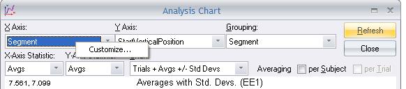
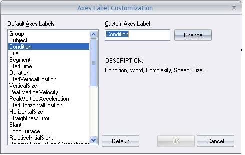
o Right click on top menu bar of the chart on the X- or Y-axis parameter name>Click Customize:
o Each axis item can have one Custom Axes Label.
o Click in the Custom Axes Label, Type a new label example, 'My condition'.
o click 'Change' and click 'OK'.
o Click 'REFRESH' on the main chart.
Details on the Chart Properties help page.
This drop-down menu provides the following settings for the chart. These settings are retained per experiment.
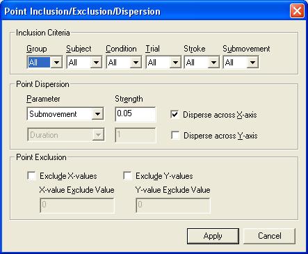
Point Inclusion/Exclusion/Dispersion
o Actions/settings > points > GO
o Inclusion Criteria: You can choose the points to be plotted for different combinations of group, subject, condition, trial, and stroke for the specific chart.
EXAMPLE: To plot the data for Group 2, Condition 1, Subject 3 and only trial 5, choose the appropriate values in the menus. If you want to see data for all trials, change the option for trial to All.
NOTE: The order of the groups, conditions, subjects, trials are in the same order as they are included under the specific experiment; Double click and expand the experiment tree to the last to see the orders.
o Point Dispersion: The points can be dispersed along the x-axis or y-axis by a certain factor with respect to condition, group, etc.
~ In the given example: In order to clearly view all the data points for each stroke, we can disperse the points by submovements (in this case, dispersion is done by Grouping = stroke) for Select Actions=Points >Go >Check Disperse X-axis by Parameter=Submovement, Strength=0.05>Apply. Then click 'REFRESH'. The following plot is obtained.
o Point exclusion: You can exclude some x-axis and y-axis values from the chart to have a better curve or to see the effect of removing a condition, group, trial etc.
EXAMPLE: Select Actions=Points >Go > Check Exclude X-values > Set X-value Exclude value = 3. The data for subject 3 is not plotted.
o Used to display the data for particular group of items in a specific color and point type.
o The grouping is specified by the top pull down menu 'Grouping' = Submovement in the chart. This option is not available if you choose 'Grouping' = NONE.
o Choose Actions/Settings = Grouping > click 'Go'.
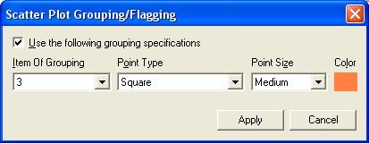
o Change the above options for Item of Grouping = 2 (Here the grouping is submovement and there are 3 submovement strokes, hence you will have options 1,2 and 3).
o The colors may be changed as demonstrated in the figure above.
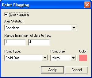
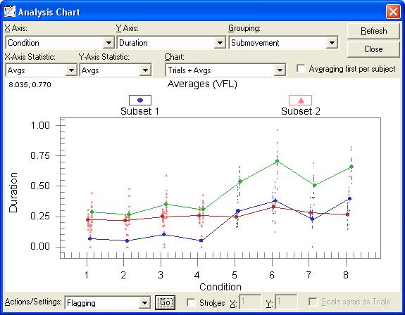
o Trials with a selectable index or data item between specific x and y values can be flagged by Actions/Settings=Flagging >Go.
o Check the option 'Use Flagging'.
~ It will yield the following graph:
NOTE: You can change the axis parameter to any value that appears on the plot, e.g. Trial, Duration, Stroke, Condition. Choosing the other options will not show any changes. The trial data points for conditions 1-4 are flagged in a specified color and shape.
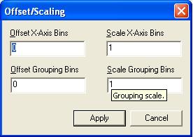
o Histograms of dependent variables are possible using Actions=Sort groups/Conditions >Go. The offset and scaling for the X axis refer to the X axis.
EXAMPLE: If the X=Duration and duration ranges from 0.2 to 1.5 and you want to cumulate values into bins 1 to 5, then you need to offset the Duration by 0.8 so that all values will exceed 1. Then you want to rescale the data range (=1.3) to 5 by rescaling factor 5/1.3= 3.9. Duration will be mapped onto the range of 1 to 5.99 and will be cumulated into 5 histogram bins.
Sorting/Selecting Groups, Subjects and Conditions
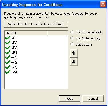
o Groups, Subjects and Conditions can be sorted or selected by Actions=Sort Groups/Conditions/Subjects >Go.
o This is the order of conditions that will be plotted on the x or y axis with numbers 1,2,.....
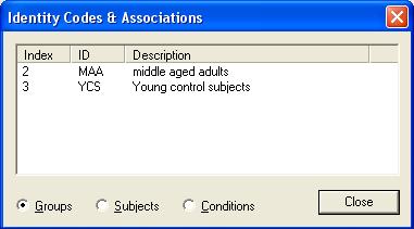
o The descriptions of Groups, Subjects, Conditions can be shown by Actions=View identities >Go.
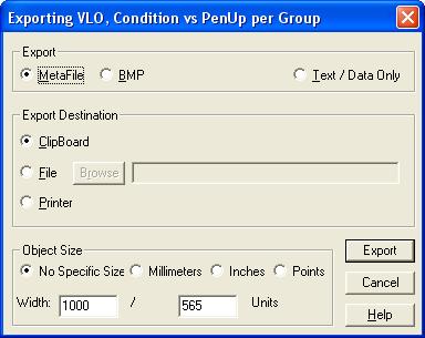
o A graph can be exported by Alt Print Screen and Control V. More extended exporting options are available via Right-clicking inside the graph >Export Dialog.
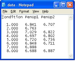
o Raw (=all features of all trials), Xmean (=all feature averages and SDs), Tabular (=feature averages and SDs all Group, Subject, Condition, Trial, Stroke indices), and exported data (=feature averages with X-axis index) can be viewed.
o EXAMPLE: Export a graph to other graphical software by Actions=View Exported Data >Go. This format can be used as ASCII importable into Microcal Origin.
o In the bottom right of the Analysis chart Check the option 'STROKES'.
o Choose the stroke number for the x and y-axis making sure that the data on both axes will be available for that particular stroke. Otherwise, a blank chart will be displayed.
o If a trial consists of a number of strokes and you want to display the data specific to a stroke, this option can be used.
NOTE: This option can be made use of only while Grouping = Stroke or plotting the strokes on x or y (in this case, there is only one stroke as there is no grouping).
EXAMPLE: Choosing Strokes x-axis = 1 and y axis = 1 yields the following chart:
| See Also |
NSHelp: Charting Trials | Trials | Chart Properties and Export
© NeuroScript LLC. All Rights Reserved.